Notes
Media Coverage of New Abu Ghraib Images: Been There, Done That?
I’m going to assume you’ve already seen the fresh images and video from Abu Ghraib. (If not, check links below). Because the story is so new, I wanted to focus on how the western media tends to visually edit and delimit controversial content.
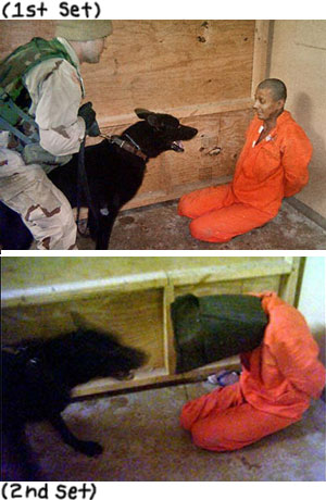
As of early this morning, at least, the BBC piece linked to a gallery of 9 images, but primarily features the dog picture. The NYT story showed a figure carrying a box along with the dog image. WAPO chose to only show the person with the box.
According to BoingBoing, 60 new still images were released by Australia’s public broadcasting network, SBS. So the question is, why will the American public likely be inundated by only one or two?
Of course, one could state all kinds of reasons. One explanation is that they are some of the less graphic. My contention, however, is that they were particularly chosen for their similarity to images we’ve already seen. Because they have less novelty, it minimizes their impact.
Take the dog images, for example. The lower shot was just released, but the top image (“1st set”) has been distributed widely from the original images released in May ’04. Cognitively, our knowledge of the first effects our registration of the second. Given the pre-existing reference, the shot from the second set plays in the mind like an advanced frame from the same sequence. So strong is this perception that one even tends to discount the fact the “new” victim is wearing a hood and is apparently a different size.
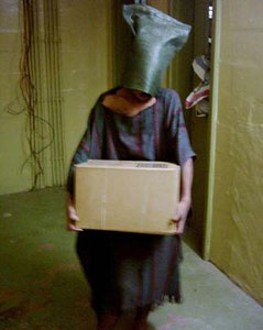
(As regards the figure with the box, it appears to be either a pre- or post image related to the famous electrode photo.)
If the press did select these images (consciously or unconsciously) to temper the reaction, some would argue that this is a good thing. With civil disturbances still occurring over the Danish cartoons, who needs a fresh set of non-recycled images to fuel the fire? Also, it’s probably true that these images really do pose a threat to American forces, as the milquetoast AP video report (contained in the NYT article above) happens to emphasize. (The report is based on the photos, but the only thing shown is footage of the outside of the prison.)
Conversely, this new material provides a much clearer and more disturbing sense of how sadistic and brutal this renegade program actually was. If anything good comes out of the leaking of this additional material, one would hope it would be the prosecution of those higher-ups that designed and implemented this abomination.
Original SBS Dateline program here. (Caution: graphic content.)
Boing Boing links to downloads/bit torrents
here.
15 shots from Sydney Morning Herald
here.
(image 1: Cameraworks. WAPO. May 20, 2004. image 2: February 15, 2006. smh.com image 3: AP via The New Yorker. April 30, 2004. www.sikhtimes.com. image 4: Wednesday, 15 February 2006. BBC.)
Follow us on Instagram (@readingthepictures) and Twitter (@readingthepix), and subscribe to our newsletter.
Topic
A curated collection of pieces related to our most-popular subject matter.
Reactions
Comments Powered by Disqus