Notes
Steve McCurry’s Rickshaw
By now, many voices have weighed in about Steve McCurry and the evidence that he has consistently and substantially altered details in his photos. A fresh set of examples appeared just last week. The “why” has also been sifted by various analysts, including Teju Cole, Paroma Mukherjee and Lewis Bush.
Cole didn’t write about the doctoring. In light of the disclosures though, his framing of McCurry’s aesthetic in compositional terms speaks to the photographer’s agenda as well as his motive, “When he shoots a wider scene, the result feels like a certain ideal of photography: the rule of thirds, a neat counterpoise of foreground and background and an obvious point of primary interest, placed just so.”
He also frames McCurry’s popular approach in the context of cultural stereotyping, “The photographs in “India” … are popular in part because they evoke an earlier time in Indian history, as well as old ideas of what photographs of Indians should look like…”
Mukherjee picks up on the “imperialist gaze,” with a backhanded hat tip, too, to McCurry’s popularity. She writes, “My generation grew up with the postcard-like Windows wallpaper and McCurry’s work is largely about the same aesthetic…. He likes his colours strong, his backgrounds exotic, his audience happy – and that audience is big. These are picturesque, touristy, professional visuals for mass consumption.”
Bush also speaks about packaging for western consumption, but explains the act more simply in terms of reduction, “McCurry is engaged in a type of photography born in the ideological battles of the Cold War and which seems to have barely evolved since. A universalized world view which often appears to be attempting to simplify the complex and sometimes uncomfortable differences between people and places rather than fully acknowledging those differences or the things that create them.”
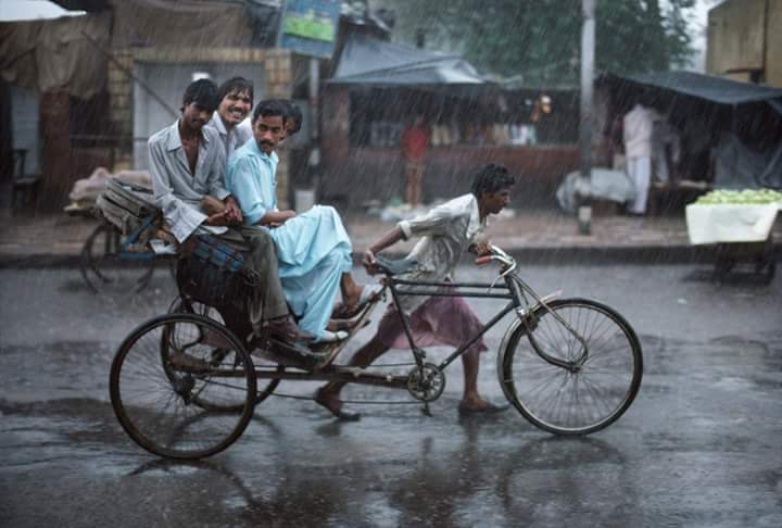
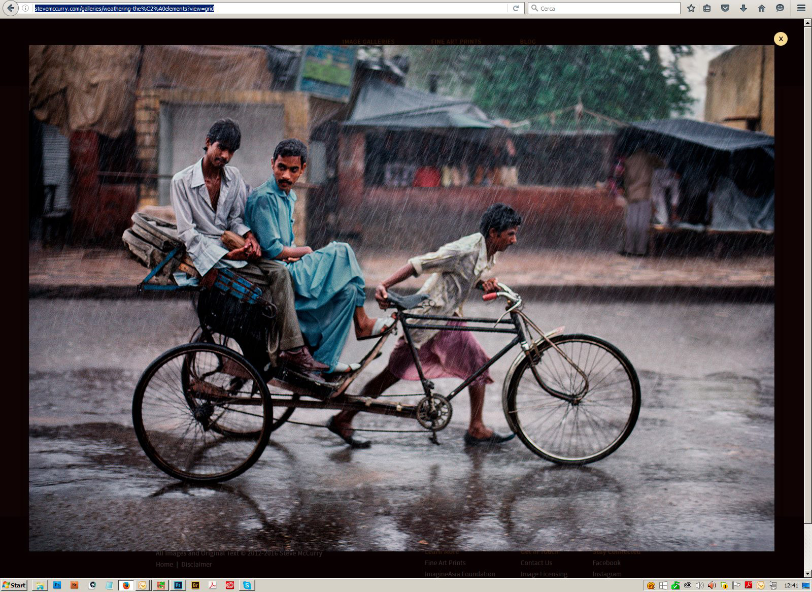
If McCurry’s aesthetic and the doctoring to achieve it deserves the criticism, I’m wondering what is positive and worthy for us to learn from it. With that goal in mind and consistent with our agenda here, I think it’s worth a more specific reading of one of the photos understood to be altered. The before-and-after shots above comes from the book, “Untold Stories Behind The Photographs,” published by Phaeton Press. The caption of the photo simply reads, “Locals riding a rickshaw through heavy monsoon rain. Varanasi, India. 1983.”
(I should note, I’m focusing specifically on the presence, absence or alteration of content, not on any difference in contrast.)
The critics above tend to talk about Curry’s ideal in a more historical way. Mindful how McCurry’s work is treated as timeless, though, I’m less interested in how much it reflects a period of either cultural or photographic history than how the two versions read today.
In the unaltered rickshaw photo, you could say we have four primary “places to go.” Those “destinations” include: the driver, the passengers, the first stand and the second one. If different “places” offer more or less interest or detail, I still want to “travel” freely to and between those destinations. I want to see what’s going on with and between the passengers. (In the final version, of course, the man literally “between” isn’t anymore.) I want to check out the beverage stand and also the fruit stand (if that’s what they are).
Yes, photographers and photo adherents follow the cardinal rule that you don’t remove something that is actually there. It’s because, though, these details and our choice to either acknowledge or ignore them is how reality and perception works. These details in the world not only have their own integrity but they are the skin that forms a body. And that’s why I love those apples (if they’re apples). I love the color and I love the clustering but, above all, I love the depth and dimensionality of that white table as it lets me think I can jump off the vehicle, walk along it into the stand and check out the bustle. (I’m talking, of course, about the version where everybody in the stand is wearing white, not the one where the guy on the left is suddenly wearing brown and his left sleeve is red. It’s like someone decided the stand had too much white to blend everything behind the rickshaw in a flat plane).
The way McCurry removes the middle passenger and sands down the two stands so they’re far less distinguishable or differentiated makes me mad. I’m mad because (as we now know) he’s forcing me to remain in the foreground, to track horizontally, and far worse, he’s communicating that I can’t be trusted with the details.
There is even a more maddening deprivation, however: It’s the story killing. The most engaging value in editorial and documentary photography today (and I’m talking as much about the single frame) is the emphasis on storytelling. The reason Sara Quinn’s eye tracking research for the NPPA is so important is because it provides empirical proof of this. What she found is that readers not only do want to visit different “destinations” in the photo and take possession of the content for themselves, they naturally seek out the most novel and compelling elements. Readers, as the study exemplifies, stitch those elements together with their own eyes and with their own brains not just to verify and confirm the captions and the context of the photo, but more significantly, to construct and take possession of their own, personal version of it.
In aborting the photos elemental truths and short-circuiting the readers story instinct, however, the most tragic act is the removal of feeling and emotion. In sensing a place and a people, what would compel you to remove the most engaging and expressive figure in the photo, the middle passenger in the rickshaw? And why would you “de-animate” that girl (if it is a girl) in front of the drink stand by cutting her in half and sticking her behind the counter? The middle passenger is likely squinting in the rain, but maybe he’s smiling. If you look at the girl (I’m assuming) in front of the drink stand, notice the quality of her pose with her hands angled in like that and maybe a tilt to her head. The posture could even be languorous. And, as we know, these kinds of qualities can be even more interesting if only suggested, distant, vague even. Because as much as visual storytelling as an art seeks out feeling (McCurry defending himself as strictly an artist now), it seeks out density and ambiguity, too, if that is what’s there.
*******
You can follow us now on Instagram.
(Published photo: Steven McCurry. Earlier version: attributed to Steve McCurry via research published at Petapixel. Caption: Locals riding a rickshaw though heavy monsoon rain in Varanasi, India. 1983.)
Follow us on Instagram (@readingthepictures) and Twitter (@readingthepix), and subscribe to our newsletter.
Topic
A curated collection of pieces related to our most-popular subject matter.
Reactions
Comments Powered by Disqus