Notes
Gabby Giffords Scales Swiss Alps: News Photo Blogs, Slide Shows and Best Practices
Up to now, scant attention has been paid — by the news media or media critics — to news photo sites, or to the nature, quality or even the differences between the photo gallery, the slide show and the photo essay. This photo, and the title of the post that drives it, gives me the opportunity to say a few words, ask a few questions, and hopefully start a more formal discussion about news photo blogs and photo galleries and slide shows.
***********
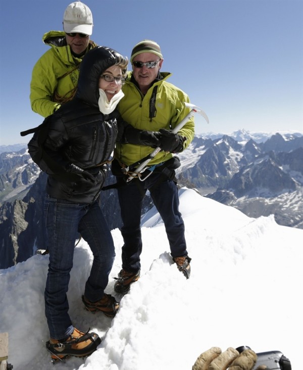
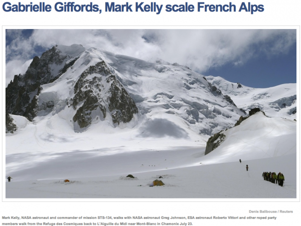
This picture above served as a major hook for an MSNBC photo blog story on Monday titled: “Gabrielle Giffords, Mark Kelly scale French Alps.” For context, by the way, the photo above actually follows the one below in the MSNBC post (I’ve clipped the post title and the caption, as well.)
(click for full size)
As called out by a number of the commenters on the post, the headline is clearly misleading. What it causes you to assume is that Giffords was on that trek in the lead photo and somehow scaled the mountain on her own. If you examine both captions (the first one not mentioning the former Congresswoman one way or the other), you can surely deduce she wasn’t along for the trek but, indeed, took a cable car to the top as stated in the last paragraph of the post. Given the power and emotion of the imagery, however, and the suggestiveness of the title on top of the quick scanning habits of typical web viewers, it’s also evident how this presentation can leave a different impression.
Besides context and accuracy, I’m also concerned about how much context a photo in a photo blog post deserves, especially a more emotional image. (On Monday also, Andrew Sullivan took it on the chin from several of his readers for posting the bizarre and troubling picture of the dazed-looking Aurora shooter, John Holmes, attending his first court hearing as one of Daily Dish’s (standard, and otherwise unelaborated) “photos of the day.” The criticism, and Sullivan’s acknowledgement, are worth taking a look at.) In the Giffords post, a more thorough Reuters article about the French Alps trip is radically condensed but not even linked to. The result is a three paragraph photo blog story (each paragraph consisting of a single sentence). With a write-up this sparse, is the reference to Giffords’ shooting in the first graf, then the reference to Giffords being shot in the head in the second graf just being economic, or is it overly skewed to the sensational?
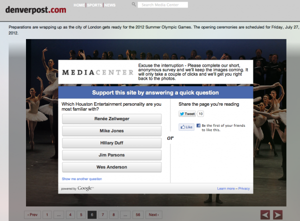
Another aspect of the MSNBC post raises the issue of the photo gallery. The post — in two separate places — promotes and links to a Giffords slideshow containing 22 background photos of the Congresswoman led off by the mountaintop image. Most or all of the images in the slideshow, however, have been previously published, most of them over and over again. I’m wondering what you think of this practice, both the recycling of familiar imagery and the creation of a “new” gallery by virtue of one new image. More importantly, however, I’m wondering what impact the proliferation of this type of rehashed content has on the goodwill and trust of the audience. I know when I hang out with people from the photo world, visual academia or my photo-blogging compatriots, there are regular jokes and snickering about photo galleries, using terms like “click bait” and “click whoring.” (And then, there is also the side issue of the more tortured strategies for embedding ads inside slideshows. I don’t know about you, but I will completely bail on any slideshow from the otherwise wonderful Denver Post Media Center once I come upon one of those Google forced-choice surveys they make you answer before you can move on.)
The ad issue aside, however, what does constitutes a quality photo gallery — in terms such as originality, narrative, length — and what is required to at least pass the minimal test, which is leaving the reader more edified than feeling the loss of a several minutes he or she will never see again?
In trying to get a handle on these formats and presentations, something important, and minimally necessary, is to define terms. I’ll briefly offer up my own then give you at least one example in which the distinctions are important. In my head, a photo gallery is typically a random collection of photographs, as in the NYT Lens blog “Pictures of the Day.” I see the slideshow at a higher level, in which the slides and captions are working together to address a common topic or theme. (This is a slideshow published by TIME Lightbox of an Olympic training camp run by the Karolyis.) And a step up from there is the “photo essay,” which I think of as a deeper, richer and more elaborate slideshow with more research, story value, and potentially more words. (The best example comes from Craig Walker which I’ll get to in a minute.)
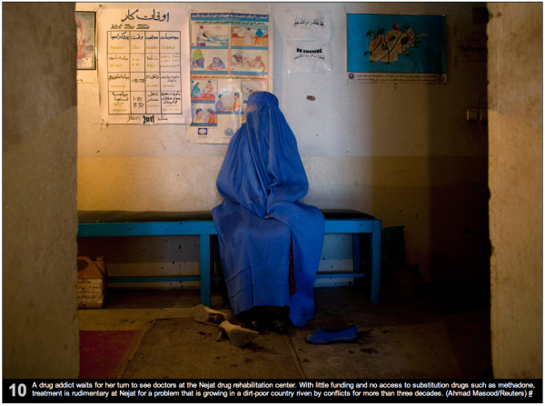
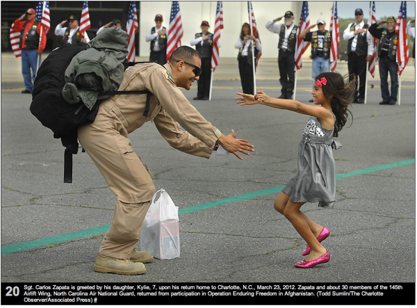
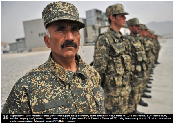
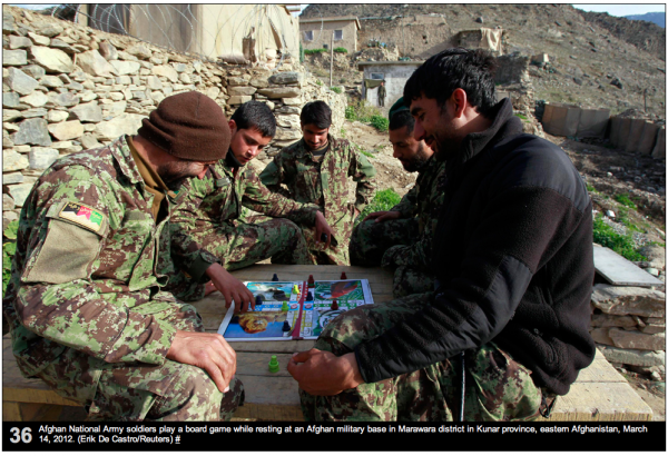
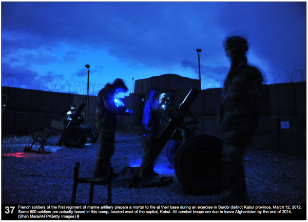
Here’s a good example, however, of a presentation that comes up short because it doesn’t know if it’s a photo gallery or a slideshow. Boston.com’s Big Picture has been doing a regular Afghanistan photo round up. The one I’m addressing consists of 37 photos published in March 2012. (If the link is still broken, find the “Afghanistan: March 2012” post in the middle of this page.) In this edition, they created a mostly random photo gallery, but they set it up – based on the introductory paragraph — as a slide show designed to tell a story about the hand-over of responsibility from US troops to the Afghanis. A specific point is made in the set up about the handing over night raids to the locals.
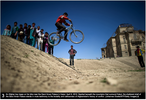
This is a sampling from the first 34 pictures which is mostly a random tour:
There is slice of life – kid on a bike.
…Social problems (drug addiction).
and a homecoming for US troops.
It’s not until image #35 that the slide show addresses the transition of military responsibility, photos #35 and #36 seeming more random or mundane than convincing, however.
Most frustrating, the last photo in the set is more pretty than anything else, a night shot of soldiers firing off a mortar. Most contradictory, though, is the fact it’s a French unit “holding down the fort.”
For all the problems and ambiguity, however, there is that instance where the format shines — that work also raising the bar for everyone else.
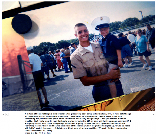
I’m not sure how widely known or appreciated it is that a photo essay (essentially a slideshow) won a Pulitzer this year, based on the brilliant work of photographer Craig Walker and his 49 frame “Welcome Home” story about Iraq veteran, Scott Ostrum. Edited and published exclusively online this past January by The Denver Post, Walker followed Ostrum for eight months documenting his trials and traumas attempting to adjust to civilian life after what he experienced in Iraq, especially in Fallujah. If you’ve never seen it, go take a look. And then tell me whether it isn’t time that the news photo blog, the news photo gallery and the news photo slideshow received more critical attention with an eye to the viewer experience, editorial rigor and a set of best practices?
(photos 1 & 2: Denis Balibouse / Reuters. screen shot 3: Denver Post Media Center. photos 4 -10: see captions — click for full size.)


Reactions
Comments Powered by Disqus