Notes
From Gaza to Kansas City: Yes Photos, But So Much More!

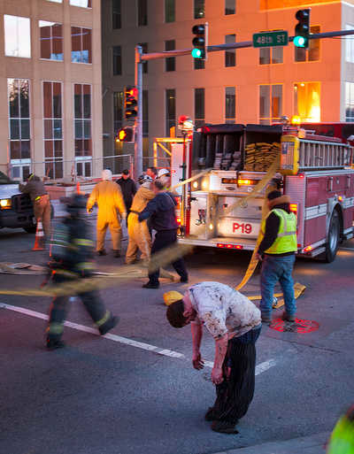
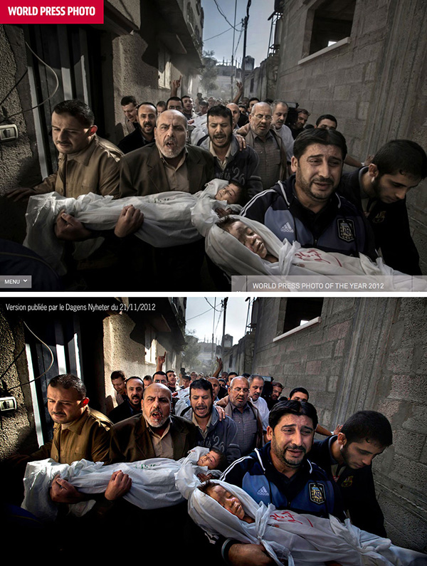
While the battle rages over the World Press-winning photo and how processed it looks (I’m tending to agree with the kid from Yale), I’m appreciative that one of the PhotoShelter commenters happened to point out the photos this week from the Kansas City fire. Yes, most of the edit looks like it was staged on the Universal backlot, like it was visually inspired by” Backdraft.”
And, if you want to make sure you’ll be permanently prevented from mistaking the KC disaster photos with real life, check out this link (via Mr. Murabayashi) from the blog, Into the Abyss, on THE COLOR GRADING VIRUS THAT IS TEAL & ORANGE!!! (… Funny, it seems the same thing was tripping me up back in 2005.)
I understand how passionate photographers can become over processing and representation issues and the extent to which the presentation of a photograph is more objective or subjective. For our purposes though, as in our speculation over Nachtwey’s tweaks to his 9/11 photos, our concern (not discussed nearly or thoroughly enough, we believe) is both the motive for and, respectively, the aesthetic, editorial, political and historical effects of the result.

In the case of Mr. Hansen’s WPP winning photo, for example — here juxtaposed with the previously published version most are comparing it to — I’m interested in why the viewer is so much more compelled by a photo that has been toned and color-corrected to look like an illustration or the frame from a video game. Further, what I’m curious about is how much the look is the manifestation of fashion or style trend as compared to, say, a moral/representational assist to accentuate the particular, stimulating us to bring fresh eyes to still another round of Gaza horror.
Which brings me back to the images of the fire, the tweaking of which is back-slappingly telegraphed by the KC Star headline: “Blaze at JJ’s near Plaza caught in striking images.” In this case, the final result is not an iota as debate-worthy as Mr. Hansen’s imagery, either in its intriguing light and color, or, certainly, its dramatic composition. Rather, what we’re expected to be seduced by — encouraged by editors and publishers in an epic chase for eyeballs — is a dusky luminescent pink, lime and orange disaster treat as one of the injured guys does yoga.
The Kansas City slideshow here.
(photo: Bob Greenspan/Special to The Star caption: A dazed victim barely stands as first responders arrive on the scene of an explosion and 4-alarm fire at JJ’s restaurant on The Country Club Plaza on Tuesday, Feb. 19, 2013.)


Reactions
Comments Powered by Disqus