Notes
The Brussels Attack: Between Two Cell Phone Photos of the Same Scene
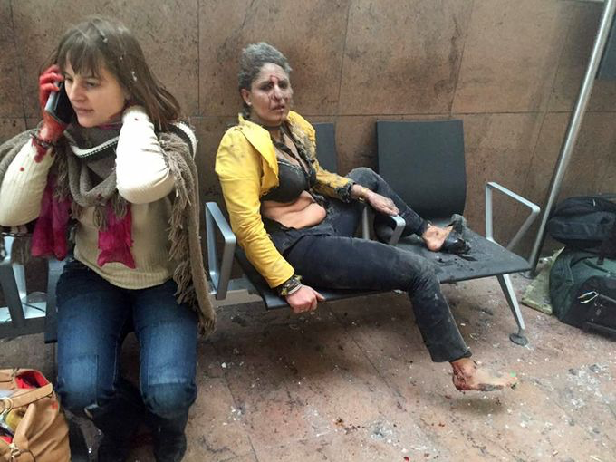
It’s not unusual that one photo, over the course of a couple hours, would become the defining image of a shattering event. What stood out from Monday’s Brussels attack, though, is how two slightly different versions from the same cellphone shared that distinction.
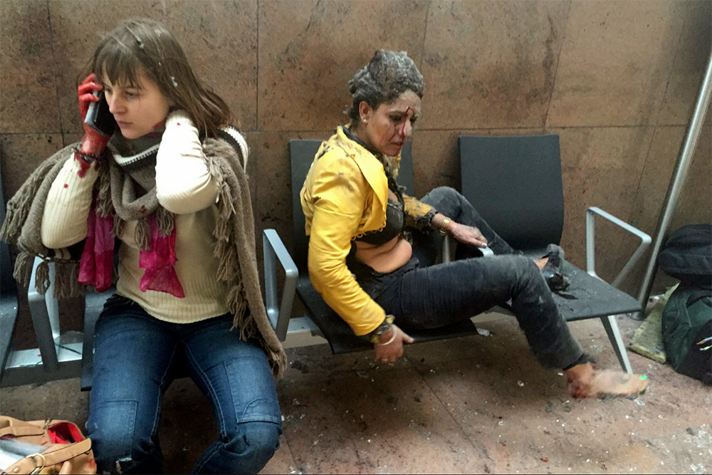
The photos were taken by Ketevan Kardava, a correspondent for the Georgian Public Broadcaster network in the Ukraine. Inside the Brussels airport after the bombing, the writer captured these different scenes. (The woman on the right, by the way, is Nidhi Chaphekar, a Jet Airways employee. You can read more backstory on Kardava and the pictures at TIME or WaPo.)
Not a comprehensive list by any means, a quick check of Newseum’s Front Pages found the first version leading papers such as The Denver Post; The Day (New London, Conn.); The Daily Herald (Suburban Illinois); The Portland Press Herald and USA Today. I mentioned the link to the TIME post. In a “first to market” feature on “the iconic photo,” TIME also showcased the first image.
The second version lead the The Washington Post, The Boston Herald, The San Francisco Chronicle and The Modesto Bee, among others. According to a knowledgeable observer, The NY Times used the first version early on Monday, then switched to the second which they also ran on yesterday’s front page.
So, how do we account for the difference? And assuming an organization like the NYT is a trendsetter, why would they go with the second?
I had the chance Tuesday night to talk to the photo director of a US daily. The director also chose the second photo for their cover. The reasoning was that the photo – particularly, the woman on the right — conveyed more intensity, more sense of the shock of the situation. I got more feedback from an online discussion thread among artists and journalists. It contained numerous comments about the woman on the phone. Several people found the expression incongruous; one perceived the hint of a smile.
Given the nature of terror, I do think people are hoping for news visuals that are consistent and understandable, even if grievous in nature. My problem with the first photo is that it’s not straightforward in terms of behavioral logic. And it’s certainly less congruent compared to the second. It’s elements do not form an understandable whole.
To explain, it’s hard for the mind to reconcile the two figures in the first shot. I agree, the main issue is the face of the woman on the cell. Surely, her reaction to the conversation overrides the immediate circumstances. And we can also appreciate how shock and injury can differ by the square inch. Still, that’s not something we parse out very well in consuming a static image. Making the manner of the women on the phone even more of an outlier is the gaze of Ms. Chaphekar. The look in our direction invites us to join in her shock and trauma. The expression of the woman on the left is also hard to square with the fact she is clearly injured. She has a bloody hand and a cut on her face, but the fact she pays no heed to the injuries when the woman next to her is overcome by hers is also confounding. Finally, it’s that discordant that Chaphekar had her shirt blown off (and is more exposed than she is in the other photo) when the phone woman looks so intact. If you hold you hand over either woman, if feels like two different pictures.
In the second photo, one the other hand, the two women are back-to-back, which lends symmetry and a more natural sense of individual space. In this case, we more understandably relate to different circumstances. And more importantly, the expression of the woman on the phone is more consistent with the situation. It reads more like concern.
So why did so many outlets prefer the first version? Well, I can offer you a practical possibility, an optimistic one and also a more cynical one.
The practical one is that people, visually-savvy as they are these days, understand that that the expression of the woman on the left is hinged to what’s happening in the phone conversation. Taking that for granted would allow a photo editor to concentrate primarily on which photo of the airline employee has more impact.
The optimistic view is that the photo is more powerful for capturing the two very different conditions. It might suggest, for example, that, in spite of the blow, life can and must go on.
And the more cynical view? It’s the horror movie thesis. Meaning, it actually scores media points for being unsettling and less emotionally logical. If it channels the terror by skewing more to the sense-less and incoherent side, let’s just say, dissonance sells.
(note: edited sentence about timing of TIME article.)
(photos: Ketevan Kardava—Georgian Public Broadcaster/AP; Caption: In this photo provided by Georgian Public Broadcaster and photographed by Ketevan Kardava, two women are wounded in Brussels Airport in Belgium after explosions were heard on March 22, 2016.)
Follow us on Instagram (@readingthepictures) and Twitter (@readingthepix), and subscribe to our newsletter.
Topic
A curated collection of pieces related to our most-popular subject matter.
Reactions
Comments Powered by Disqus