Notes
Washington Post’s Pioneering Look At The Bush Pioneers (As Well As Other Maps Of The Big-Boy Networks)

It looks like the Washington Post is trying to stake a claim as a leader in multimedia news and investigative graphics.
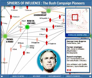
In this interactive diagram, titled Spheres Of Influence, the viewer is able to track major Bush contributors, as well as identify the time and sphere of Bush’s life in which the relationship was formed.
As clever as it seems, this mapping device basically builds on the work of the late Mark Lombardi, an artist who created hand drawn diagrams mapping political connections (perhaps his most famous tying together George Bush, Harken Energy and the Saudis). (A few sites, including albany.edu and NPR do a so-so job of representing his work, but it’s hard to show at multiple scales. I’d say his book is probably the best way to get to know him.)
By the way, if you’re particularly interested in “political who-knows-who,” either from a muckraking standpoint, or just from a fascination in the “six degrees of separation,” you might also want to look at Political Friendster. (Because it’s community-designed in the same spirit as Wikipedia, it’s still in a “build-out” stage.)


Reactions
Comments Powered by Disqus